Quick but effective UI update to Eventscase’s main product, the Digital Venue. In this project I’ve worked on the design system to give it a more professional and competitive look, while giving the minimum amount of work to the development team.
Context
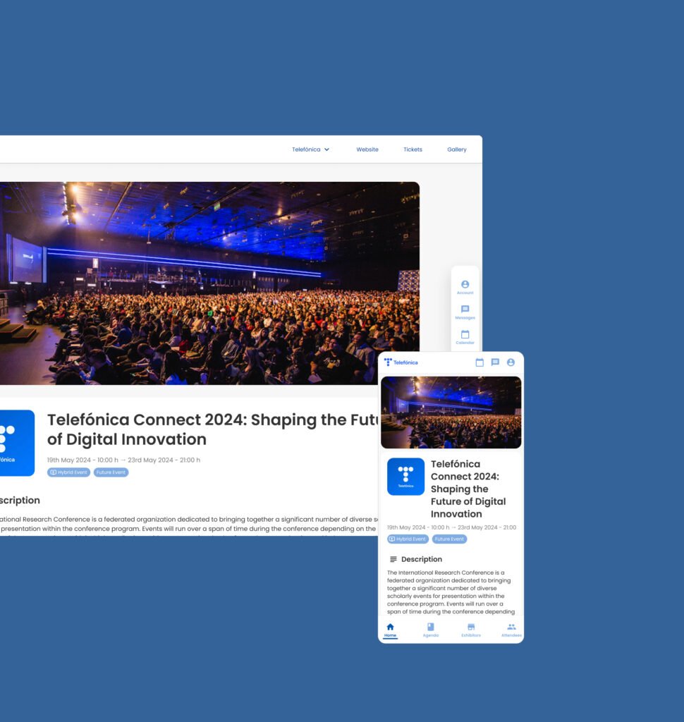
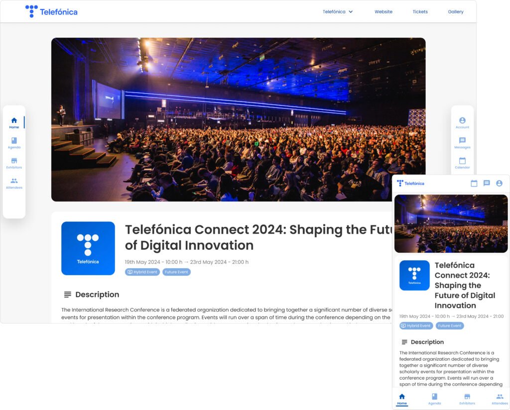
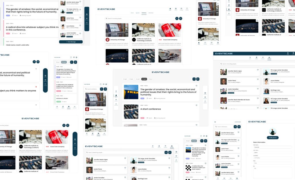
The Digital Venue is the platform where online events are hosted and where all event information is displayed, whether the event is online or in person. It is highly customizable by the client and can feature the event agenda, speaker and exhibitor information, attendee lists, a chat system and much more.
Date
March 2024
Role
Art director
UI designer
Tools
Figma
Storybook
Jira
The reasons & goals
There were several reasons that led the product team to consider this project. First, although the product had been designed only three years ago, it appeared outdated and less innovative compared to competitors. It had some UI issues, such as a lack of hierarchy (especially in text sizes) and cramped spaces, and the layout needed to be decluttered. The company was at a critical juncture against its competitors, so improving the product’s appearance and the image it projected to clients was highly prioritized.
Second, these modules were also to be embedded in the Event App (another product), which allowed us to redesign and unify both products’ design systems, streamlining the work by doing it only once.
Third, during my time at the company, I noticed several inconsistencies in the design system, making this a good opportunity to address and update them.
Finally, the front-end development team had a two-week window of availability while the back-end team was occupied with other tasks, making this the ideal time to focus on the front-end redesign.
What changed?
Exhibitor card
The exhibitor card, like most components, only required a UI update:
Evenly rounded corners for a more modern, sleek appearance
Clearer hierarchy between the title and body text
Added margins & more spacing between elements to give the content breathing room
old component
new component
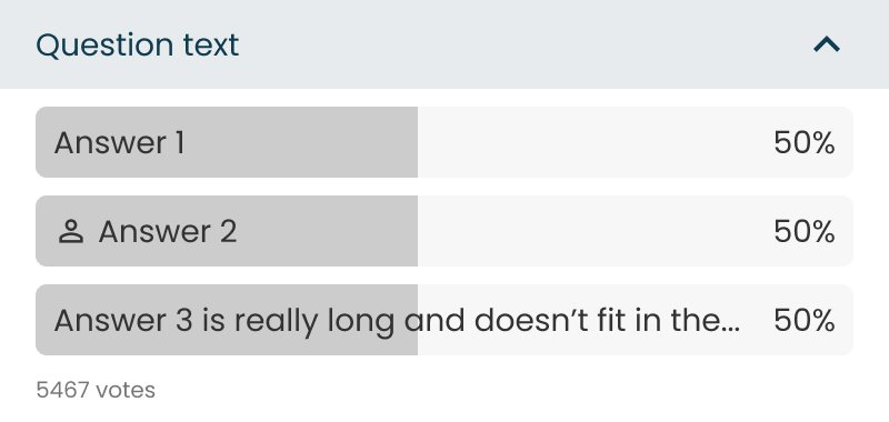
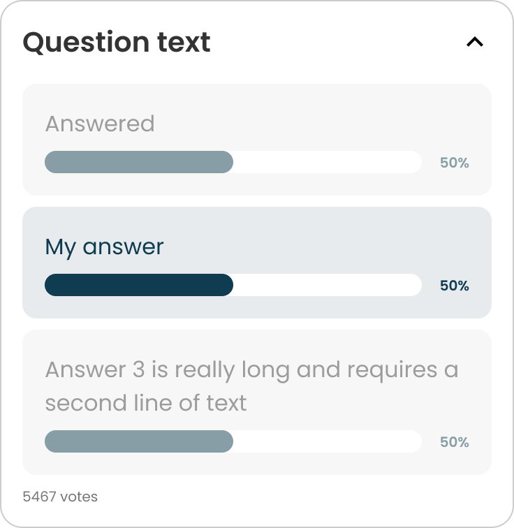
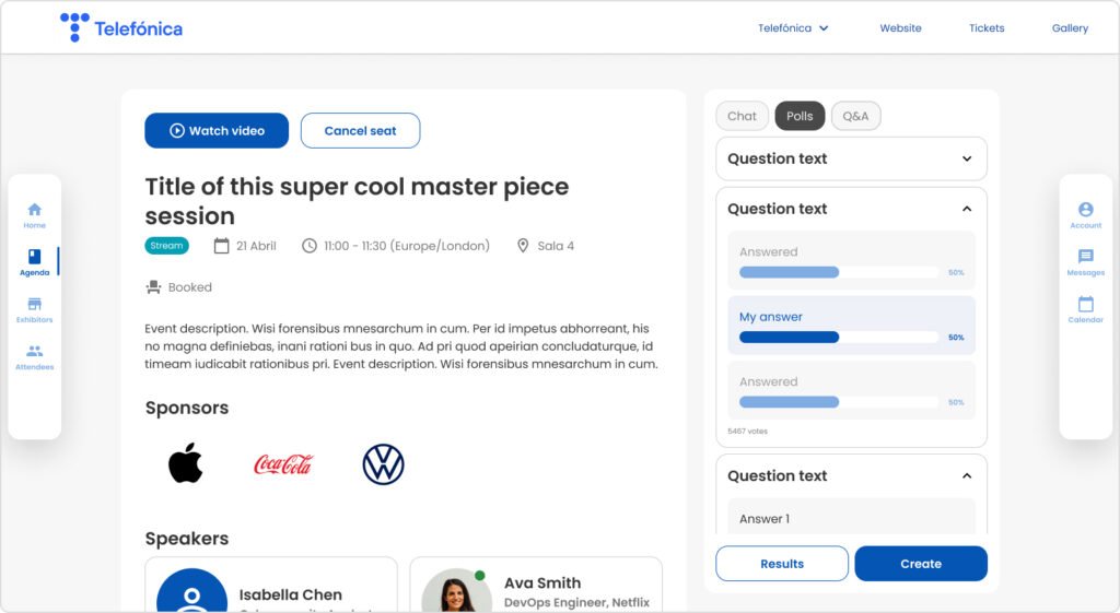
Poll box
In this case, the component also had a UX issue: the number of characters allowed in the response was limited by the available space, restricting users to answers of a specific length. The following changes were made:
Increased text size for better readability
Clearer hierarchy between questions, answers & percentages
Adaptive frames for answers, allowing them to expand as needed
A softer, more visually pleasing division between answers
A more understandable method to highlight the selected answer
old component
new component
previous design
new design
previous design
new design
Process
Since one of the project’s constraints was to limit the development team’s implementation time to no more than two weeks, it was crucial to ensure the changes were easy to see and understand.
Some of the design proposals
Making it easy for dev team
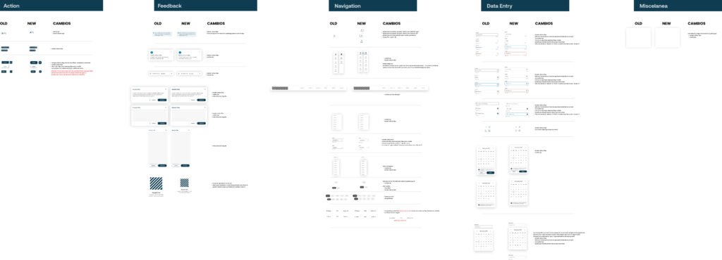
All components were displayed in a table, organized by their original design system categories. Each table had three columns:
The original component
The updated version
A list of all changes with comments, where applicable
You can see the whole design system tables in the button below.
1. In general, I believe it’s essential to involve development teams in the design process. In this case, early conversations with them were especially helpful in building an efficient, quick system for visualizing and identifying changes.
2. A significant mistake I made was not duplicating the entire original design system before starting the updates. Although the old components are still visible in the tables I created for the dev team, having an exact copy of the design system as it existed before the changes would have been better.